Hey guys.
As I’m working on the Poker game, I realize that I’ll need to add some buttons to it. While v3 of Phaser does not have a native button in it like v2 does. I decided to add one. And since I’m using Arian’s Phaser Editor v3, which recently got User Components added to it, why not use them to create the buttons? Let’s go for it!
You can check out a demo here.
What Is A User Component?
User Components allow you to add custom properties to existing game objects and further extend their functionality. For example, if you have characters in a game, you can add a “Character” component to add the usual stats to character instances that you add to the scene, such as health, speed, name, etc.
When you build a User Component, you add properties to it, using some primitive data types, such as string, number, or boolean. You can also use expressions that can be evaluated as they are entered into the editor. They will run within the scene on which the game object they are added to lives.
This article will not go in depth on User Components. For more information, see the help pages. You can also look at Arian’s recent article for additional inspiration.
Building A Button Component
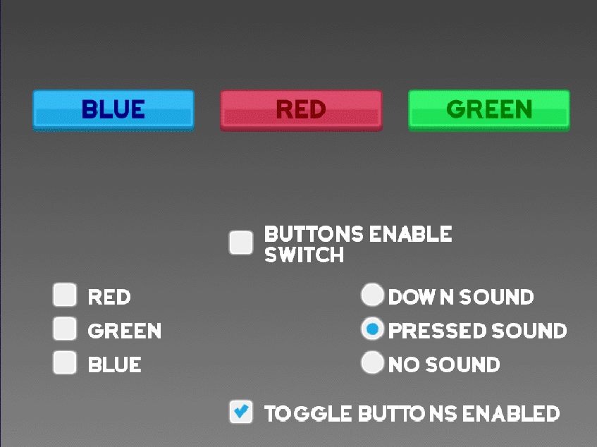
First, let me say where I got inspiration from regarding designing the User Component itself. It was from v1 of the Phaser Editor. Since it supported Phaser v2, which has native support for buttons, v1 took advantage of that. I decided to use its UI as a starting point:
As you can see, with Phaser Editor v1, you have several properties. Let’s go over them, and see how we would add them as properties for our User Component.
There are four frames that determine the button’s appearance based on its state. They are overFrame, outFrame, downFrame, and upFrame (which I will call normFrame, short for “normal frame”). Since these specify the frames of images that the button will use, they can be assigned strings in the User Components Editor.
Next, have a look at callback, and callbackContext. Since these two refer to functions or references to objects, they would be assigned the “Expression” type.
There are a few more properties we’ll add to our button component:
- Disabled Frame: We’ll use this to display our button when it is disabled. While Phaser doesn’t natively support a disabled state, I decided to add that one myself. Like the other frames, this property will be a string.
- Enabled: Since we can disabled the button, you can use this property to specify if the button will be enabled by default. This property can be assigned a boolean type in the User Components Editor. We’ll assign it a default value of
true.
Note: When you are creating component properties, you can also assign them default properties.
- Pressed Sound Key: Sometimes, you may want a button to produce a sound as additional feedback that a button was pressed. This can be a string.
- Down Sound Key: You may instead want to define a sound that plays when the button is first down.
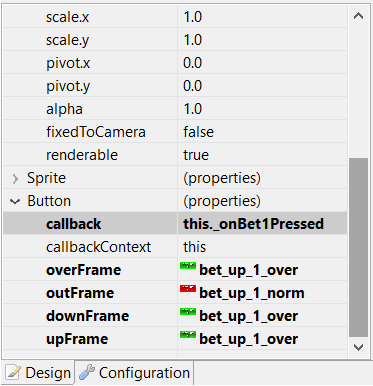
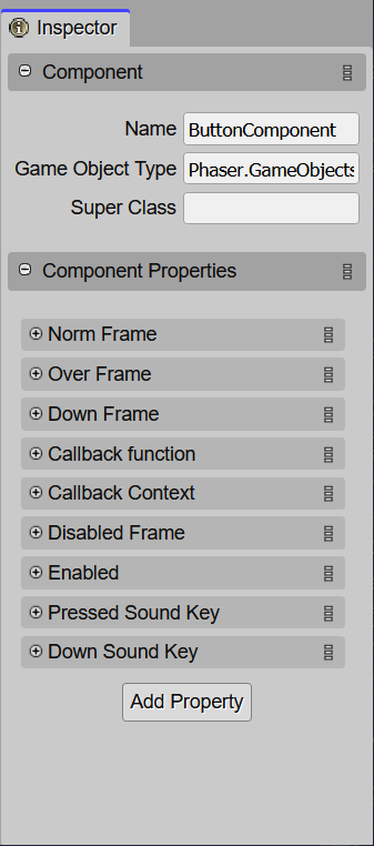
For this article, let’s name the button component…. waaaaait for it…….. ButtonComponent. 😋
After setting up the properties, my component in the editor inspector looks like this:
Setting Up The Game Object
The type of Phaser game object that will use this component will be a Phaser.GameObjects.Image. The image is an interactive object that can respond to pointer events (mouse for desktops and laptops, and ya fangah for mobile/touch devices), such as over, out, up, and down states.
The gist of it works like this:
- In the constructor of your button component, you’ll make the game object interactive using
Phaser.GameObjects.GameObject.setInteractive. In the config object, you can optionally set theuseHandCursorproperty totrue. Note that this only applies to mouse cursors. - Add the down, over, and out input events to the game object. Also add their respective event handler methods to the ButtonComponent class. (There are a few caveats to setting these up; these will be addressed later in this article.)
- To handle “pressed” events, you’d listen to the up property. This is where the callback and callback context properties come in. (There are a few caveats to setting these up; these will be addressed later in this article.)
- In their respective event handlers, you’d set the down, over, or up image frames using the corresponding frame from the User Component properties defined earlier.
Note: The event handlers (as well as the other code you’d add) would go into the code sections within ButtonComponent the User Components compiler allows you to add code.
You can add enabled getter/setter to determine if the button is enabled or not. This is where the Disabled Frame property comes in. You set the frame of the image to this frame if the value of the disabled frame if the button is disabled.
- You could try setting the initial enabled/disabled state using the Enabled component property, but there is a problem to this… as you may have guessed, we’ll get to that later. 🙂
Caveats
Now, we finally get to those few things to be aware of when creating this button component. (:
First, when you press down on a button, it’s state changes to the Down Frame image. However if you hold the pointer down while moving over another button, you can also interact with that button an the same time. Normally, you should not be able to do this, as you should only be able to interact with one button at a time if it is pressed. Also, if the button is pressed, then the pointer is moved out of the button, then released, the button will not receive the up handler, not clearing the down status.
To handle this, I borrowed a concept from Microsoft known as capturing the mouse. The idea is when a button is pressed, that button “captures” the mouse, meaning, while the mouse button is down, that button accepts all mouse input, even if it moves over other buttons.
I took that concept and adapted it to this button component. When a button is first pressed, it will “capture” the pointer. A reference to that button can be saved in a static property; we’ll call it capturedButton.
Let’s See Some Damn Code Already! >:D

Only the down, over, and out event handlers were added to the game object. However, the up event handler was not added to the game object. Instead, the up handler is added to the scene that the game object is on. This is done, so that we can emulate the captured button component receiving events, even if the pointer has moved out of the component’s game object.
Also, this handler is only added inside the game object’s event handler – and remember to add it to the game object’s scene:
// "this" is the ButtonComponent instance

// add down, over, and out input event handlers to the game object
this.gameObject.on(Phaser.Input.Events.GAMEOBJECT_POINTER_DOWN,
  this.onInputDown, this);
this.gameObject.on(Phaser.Input.Events.GAMEOBJECT_POINTER_OVER,
  this.onInputOver, this);
this.gameObject.on(Phaser.Input.Events.GAMEOBJECT_POINTER_OUT,
  this.onInputOut, this);
...
onInputDown() {
  // capture the button component
  ButtonComponent.capturedButton = this;

  // update the down state flag
  this._isDown = false;

  // add a one-time up input handler to the scene
  this.gameObject.scene.input.once(Phaser.Input.Events.POINTER_UP,
    this.onScenePointerUp, this);

  this.updateButtonImage();
}
...
onScenePointerUp() {
  const captured = ButtonComponent.capturedButton;

  // clear the captured button component
  ButtonComponent.capturedButton = null;

  // if a button is captured, only handle up events from that button
  if (captured !== this) {
    return;
  }

  // clear the previously captured button's down state flag
  this._isDown = false;

  if (this._isOver) {
    this.updateButtonImage();

    // a button "press" only counts if the pointer was released while it
    // was also over that same button
    if (this.callback) {
      this.callback.call(this.context, this);
    }
  }

  // if an over-non-captured-button is set while the captured button is
  // being released, handle input for that button as if the pointer just moved
  // over it
  const nonCaptured = ButtonComponent.overNonCapturedButton;
  if (nonCaptured) {
    ButtonComponent.overNonCapturedButton = null;
    nonCaptured.onInputOver();
  }
}
...
onInputOver() {
  const captured = ButtonComponent.capturedButton;
  if (captured) {
    if (captured === this) {
      this._isOver = true;
      this.updateButtonImage();
    } else {

      ButtonComponent.overNonCapturedButton = this;
    }
  } else if (this.gameObject.scene.input.activePointer.primaryDown) {
    ButtonComponent.overNonCapturedButton = this;
    this.gameObject.scene.input.once(Phaser.Input.Events.POINTER_UP,
      this.onScenePointerUp, this);
  } else {
    this._isOver = true;
    this.updateButtonImage();
  }
}
...
onInputOut() {
  const captured = ButtonComponent.capturedButton;
  if (captured) {
    if (captured === this) {
      this._isOver = false;
      this.updateButtonImage();
    } else {
      // clear the non-captured button
      ButtonComponent.overNonCapturedButton = null;
    }
  } else {
    // this button
    this._isOver = false;
    this.updateButtonImage();
  }
}
Ok, quite a bit going on here. Well, you asked for some damn code, and you got it. 🤨
First the down, over, and out event handlers are added to the game object.
In the down event handler, onInputDown, the current button component is “captured”, and an up input event handler is added to the scene, instead of the component. The comments should give you the gist of what’s going on. However, I do want to point out something:ButtonComponent.overNonCapturedButton.
This static property is used when a button is captured, and the pointer moves over a different button. While we still want to ignore processing for that “over-non-captured” button, we want to set a reference to it.
Reason is, if the pointer is released (up input event) while over this button, after releasing the captured button, we want to immediately update the over state of the non-captured-button. You can see this happening in the last code block of the onScenePointerUp function.
Next, let’s have a look at enabling and disabling the button.
get enabled() {
  return (this._enabled);
}

set enabled(value) {
  this._enabled = value;
  this.gameObject.input.enabled = this._enabled;
}
Here, I assigned an ‘enabled’ getter and setter to the ButtonComponent class.
Normally, if the button is disabled, you disable the input property of the game object and update the game object display frame. to display the disabled image. But what if the button was captured while it was disabled? Or what if an over-non-captured button is set while the captured button is disabled?
And if you enable the button, the input property is also re-enabled, and the game object will display the “normal” (up) display frame. But what if the pointer is over the button at the moment it because enabled?
These questions can be answered in the updateAfterDisable, updateAfterEnabled, and updateCapturedStatesAfterOff functions.
Let’s make the following adjustments to the above code:
set enabled(value) {
  this._enabled = value;
  this.gameObject.input.enabled = this._enabled;

  if (this._enabled) {
    this.updateAfterEnabled();
  } else {
    this.updateAfterDisable();
  }
}

updateAfterDisable() {
  this._isDown = false;
  this._isOver = false;
  this.updateCapturedStatesAfterOff();
  this.updateButtonImage();
}

updateAfterEnabled() {
  const input = this.gameObject.scene.input;
  const gameObjects = input.hitTestPointer(input.activePointer);
  this._isOver = gameObjects.indexOf(this.gameObject) > -1;
  this.updateButtonImage();
}

updateCapturedStatesAfterOff(): void {
  if (ButtonComponent.capturedButton === this) {
    ButtonComponent.capturedButton = null;

    const nonCaptured = ButtonComponent.overNonCapturedButton;
    if (nonCaptured) {
      ButtonComponent.overNonCapturedButton = null;
      nonCaptured.onInputOver();
    }
  } else if (ButtonComponent.overNonCapturedButton === this) {
    ButtonComponent.overNonCapturedButton = null;
  }
}
One final piece of code I want to highlight is actually updating the gameObject’s display image to represent the button’s state.
Sometimes, you don’t want to have over, down, or disabled display. You only want a single image (the “normal” / up) frame. I designed the component so that you only have to specify the Normal Frame of a button component, and it’ll use that for all it’s image states.
Let’s have a look at how this is achieved:
updateButtonImage() {
  const buttonImage = this.getGameObject();
  if (!buttonImage) {
    return;
  }

  let frame;

  if (!this._enabled) {
    // button is disabled. try the disabled frame first, and if it's
    // not available, try the normal frame
    frame = this.resolveFrame([this.disabledFrame, this.normFrame]);
  } else if (this._isDown) {
    // button is down. keep moving
    if (this._isOver) {
      // button is over AND down. try the down frame first, then try over,
      // finally, normal
      frame = this.resolveFrame([this.downFrame, this.overFrame,
        this.normFrame]);
    } else {
      // this would happen if the button is captured, but the pointer has
      // moved out of the game object image
      frame = this.normFrame;
    }
  } else if (this._isOver) {
    // button is over but not down
    frame = this.resolveFrame([this.overFrame, this.normFrame]);
  } else {
    // last case
    frame = this.normFrame;
  }

  buttonImage.setFrame(frame);
}

doesFrameExist() {
  const buttonImage = this.getGameObject();
  return (frame in buttonImage.texture.frames);
}

resolveFrame(framesOrder) {
  // frames are resolved in the order they are specified in the array.
  // the first frame that exists in the texture will be used.
  let index = 0;
  for (; index < framesOrder.length - 1; index += 1) {
    const frame = framesOrder[index];
    if (this.doesFrameExist(frame)) {
      return (frame);
    }
  }

  return (framesOrder[index]);
}
Bonus: Checkboxes and Radio Buttons
You likely noticed from the demo, that there are also checkboxes and radio buttons.
To create these types of buttons, I first tried to extend the BaseButton class and create a CheckboxComponent component. However, if you create a component that extends another component, it doesn’t carry over all the component properties from the base component class. So, I ended up using composition, adding the ButtonComponent as a member object of the CheckBox component.
Inside the Checkbox constructor, you could instantiate your button component like:
this.buttonComponent = new ButtonComponent(this.gameObject);
A normal button has four states: normal, over, down, and disabled. But a checkbox has eight states, those four, times an “on” (check) and “off” (unchecked). My Checkbox component properties ended up looking like this:
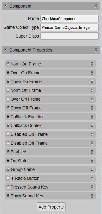
I won’t go into details about the check box, but the ButtonComponent does handle most of the work. Many of the functions just get passed from the Checkbox component to the Button component.
A key difference is toggling the checkbox’s “on” state each time it’s pressed…
this.isOn = !this.isOn;
Updating the game object’s image based on the state is handled a little a differently. Something like this:
...
const component = this.buttonComponent;
if (this._isOn) {
  component.normFrame = this.normOnFrame;
  component.overFrame = this.overOnFrame;
  component.downFrame = this.downOnFrame;
  component.disabledFrame = this.disabledOnFrame;
} else {
  component.normFrame = this.normOffFrame;
  component.overFrame = this.overOffFrame;
  component.downFrame = this.downOffFrame;
  component.disabledFrame = this.disabledOffFrame;
}
...
We’re basically just setting up the button component’s properties depending on if the checkbox is on or off.
Setting Up A Radio Button
As for a radio button, once press it on, you can’t press it off, unless you press another radio button in the same “group”. That will turn that radio button on while turning this one off.
Implementing a group was a bit tricky, because I didn’t want to have to actually code anything additional outside of the inner workings of the Checkbox component every time I wanted to create checkbox objects. So, on the component properties, the “Group Name” (string) is a data property that gets added as a a data property of the Scene that the checkbox game object image is added to.
And of course, don’t forget to check the “Is Radio Button” box in the Checkbox component properties, if you want your checkbox to behave like a radio button. 😉
In the constructor, the Checkbox component will attempt to fetch an object (that would include an array of CheckboxComponent objects. If the array doesn’t exist, it creates it, and assigns the group to the scene’s data property. Then it assigns itself to the group.
Note: This “group” is not necessarily Phaser’s Group object. You might prefer to make a separate class for this to keep code organized, especially if your group will provide additional behind-the-scenes functionality.
Setting that up might look something like this:
// this.groupName is the "Group Name" component property

if (this.groupName) {
  const existingGroup = this.gameObject.scene.data.get(this.groupName);

  if (existingGroup) {
    this._group = existingGroup;
  } else {
    this._group = [];
    this.gameObject.scene.data.set(this.groupName, this._group);
  }

  this._group.push(this);
}
Note: If you use this method, if you use multiple groups, make sure each group name is unique.
Handling Press Actions For Checkboxes And Radio Buttons
Since there is an internal ButtonComponent handling all the input events, we need to have the “pressed” event forwarded onto the Checkbox component so it can properly respond, which includes invoking the callback provided in the Checkbox component properties.
You can set that up using something like:
this.buttonComponent.callback = this.callback;
this.buttonComponent.context = this;
...
callback() {
  // when the button is pressed this function is called
  if (this.isRadioButton) {
    this.handleRadioPressed();
  } else {
    this.handleCheckPressed();
  }
}

handleCheckPressed() {
  // toggle the on state and be done with it
  this.isOn = !this.isOn;
  this.dispatchCallback();
}

handleRadioPressed() {
  if (this.isOn) {
    // if the radio button is already on, skip everything else
    return;
  }

  this.isOn = true;

  // turn off all other buttons in the group EXCEPT this one
  this._group.forEach((checkbox) => {
    if (checkbox !== this) {
      checkbox.isOn = false;
    }
  });

  this.dispatchCallback();
}

dispatchCallback() {
  if (this.chkCallback) {
    this.chkCallback.call(this.context, this);
  }
}
Wrapping Up
To add the component to a game object image, turning it into a button, drop an image onto your scene, add the ButtonComponent to it, and set up the properties. Be sure your callback and context are properly referenced in your code.
There is another aspect of buttons: visibility, and playing sounds when the button is pressed or is down. Making a button visible is handled similarly to enabling and disabling a button. I’ll leave that to you as an exercise. 🙂
Again, if you want to have a look at the buttons demo, it’s here.
That’s pretty much it for building a button component in Phaser Editor using the User Component! At least, this is how I decided to design one, as I’m sure there are other ways to do it.
Finally, sign up using the form below to receive updates to playable builds (of the Poker game I’m currently working on). You’ll get e-mails to builds you can interact with to some degree as I make noteworthy progress.
Talk to you later,
– C. out.